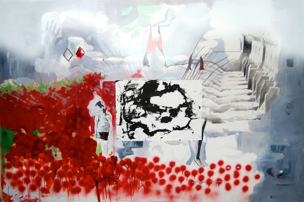
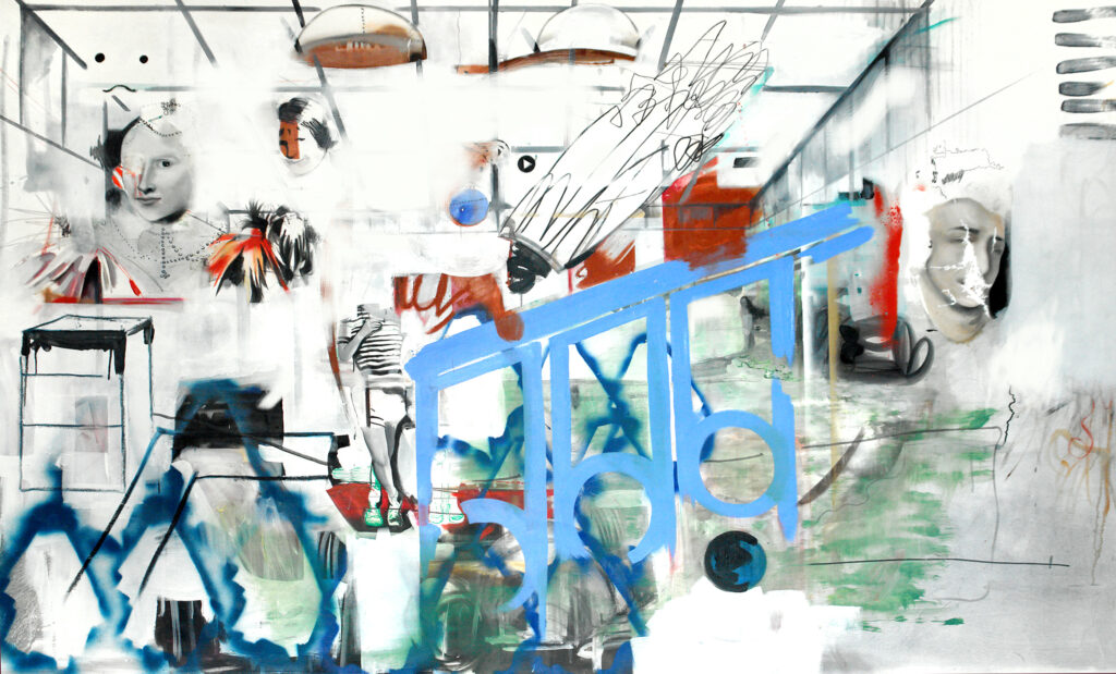
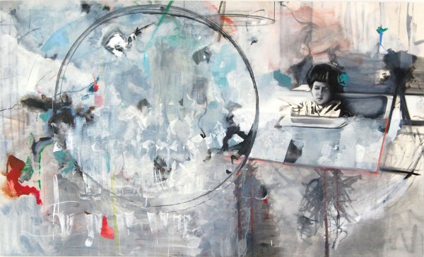
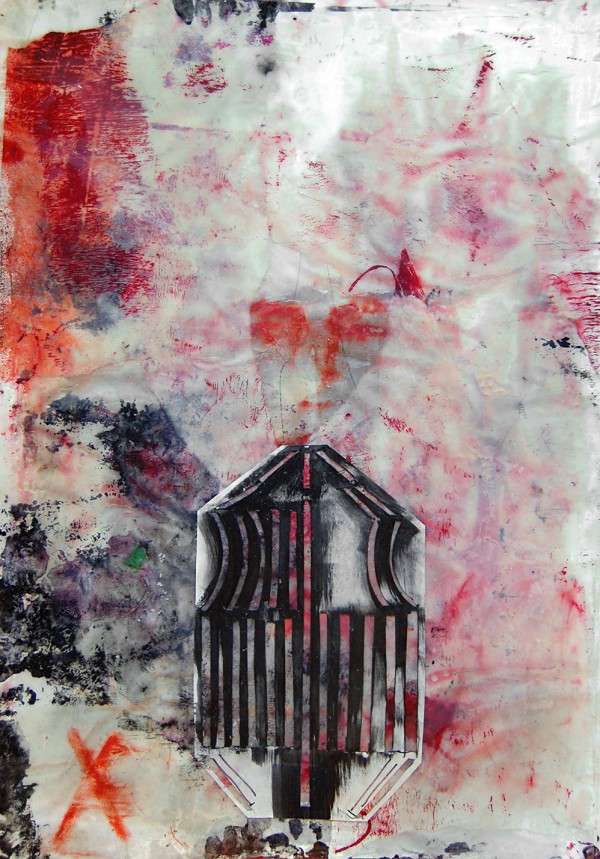
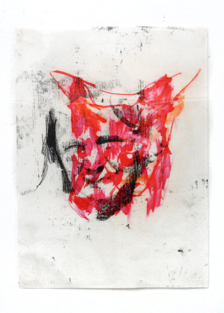
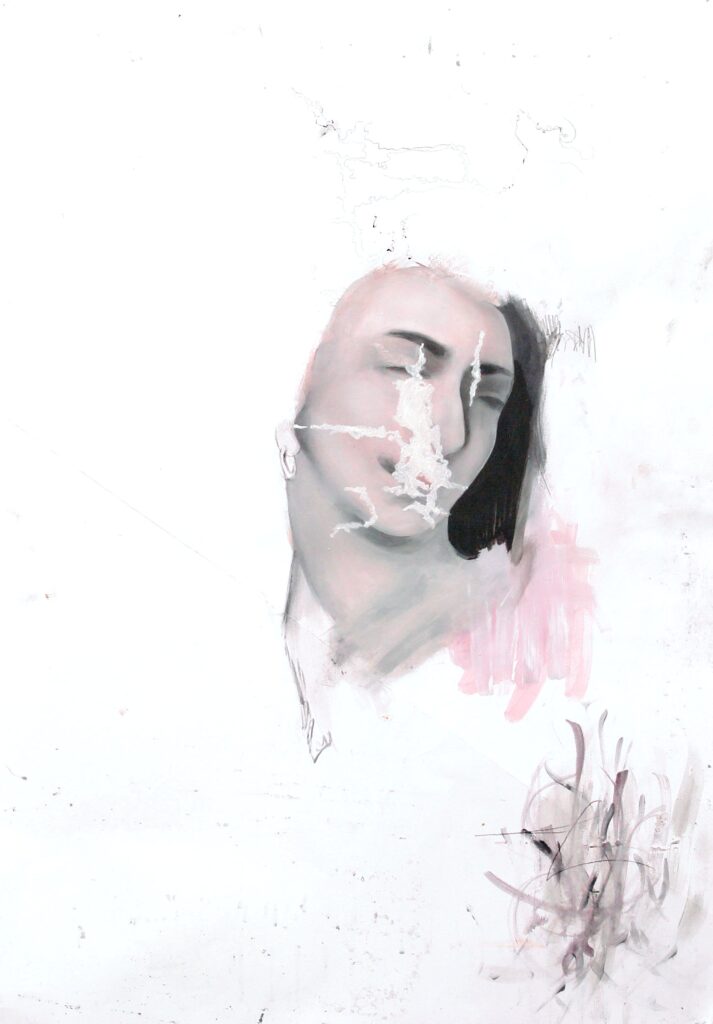
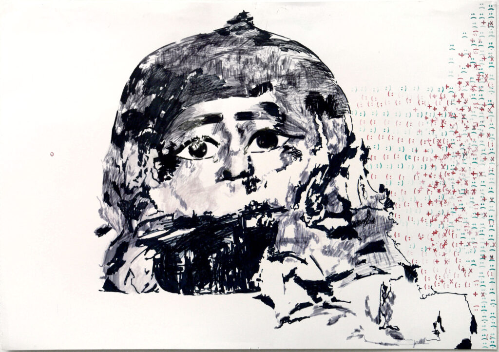
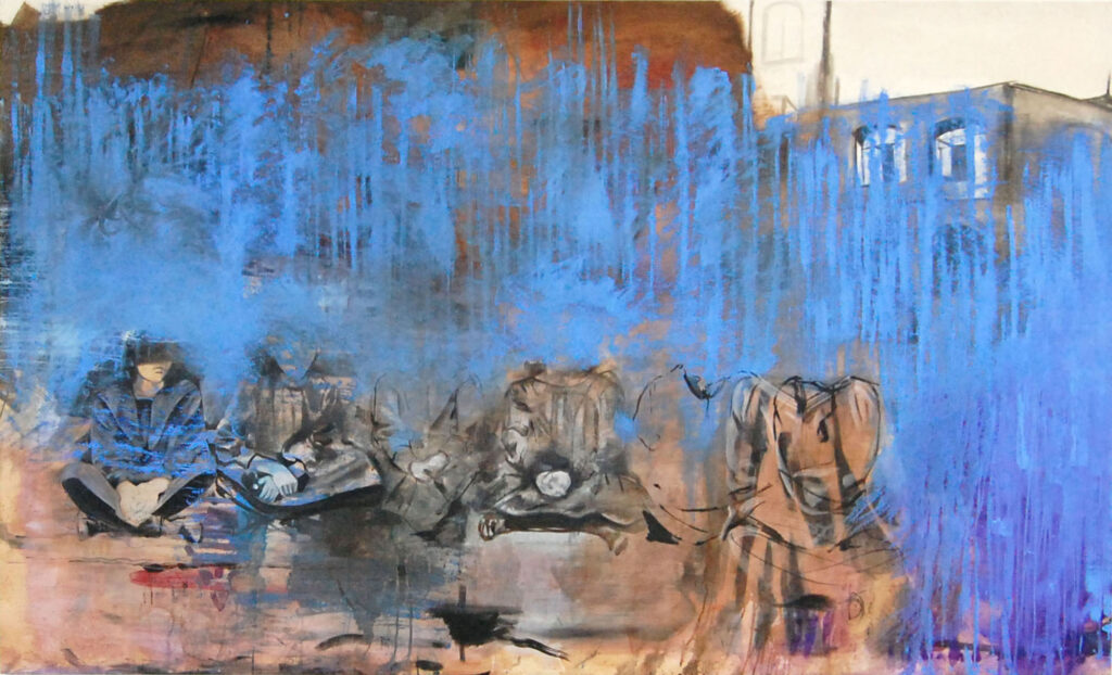
Compositionally reminiscent of the work of David Salle and certain sculptural gestures in the oeuvre of Jasper Johns (especially during the 1960s), Düsseldorf-based artist augments these precedents with a decided flare for digital aesthetics. Digitality pervades her works, where the juxtaposition of elements that only becomes visible by way of a computer screen acts as a kind of specter haunting the traditional media of oil on canvas. Whether one calls this post-internet painting or proto-digital painting, Julia Dauksza’s artistry is distinguished by sprawling diasporas of figures fixed in mural-like space, like images suspended in pure virtuality, foisting on viewers a level of uncertainty where they have to interactively fill out each work—co-creating it, as it were.
In Dauksza’s large-scale paintings one notes a tendency to deny any single vantage point; a compositional strategy that could be misrepresented as distraction, but which is better understood as an effort to disrupt any pretense of contemplative stillness. There is no where in her work; rather, there is a being-there in a tactile or iconographic way. The figures peopling her canvases, revenants of assembly-line industrialization, have a shadowy aspect about them, like pools of nothingness emerging from the perspectival depths of digital space, which works to both link and separate the scenes so hauntingly portrayed by her paintings.
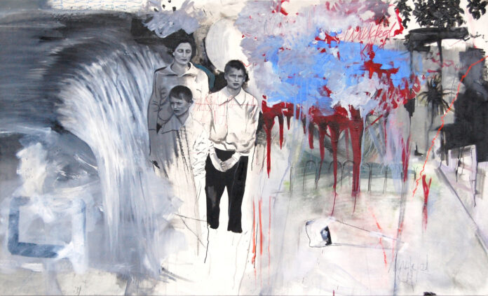
“Milkfed†(2013) offers a particularly representative example of this. The newspaper grey tones filling out the two boys with their mother, along with the truncated waterfall beginning at the painting’s leftmost edge, indicate a life populated by stand-ins, signifiers bereft of signifieds, where the nebula of red and blue abstraction near the painting’s center contrasts vividly with the effacement of figures locked in representational space. The painting is rounded out by an item of constructivist abstraction to the bottom right and the introduction of suburban, landscaped foliage at the upper right-hand corner. This merging of the photographic and reproducible with the abstract doesn’t so much complete the painting as give it jagged edges, supplying the requisite tension for figures to appear in the process of their own disappearance.

